Tuesday, January 22, 2008

little lighter..

Responding to what Sook Chiung said at class today, here it is our new and improved mascot (now with colour also!) of MM068-1!!

enjoy.. ^^


What we trying to say here is, even though we are a really small class (represent by that little lighter..huu) but we always have a BURNING SEMANGAT INSIDE to give a 'light' to each others!!hahahahh xD


isit?! ^.^

Saturday, January 19, 2008

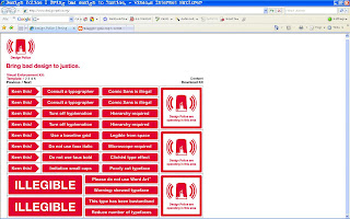
i want this!

Hey! check this out, they have the sticker that we ALWAYS want to!!hahahh xD

URL: http://www.design-police.org


Samle picture >>

Thursday, January 17, 2008

history behind MHP (Most Hated Person)

After watching an incredible, n crazy movie with Sweii and the others at class -MM Lab1- today we had a sharing session, talking about what really influences us in our live and also in the style of how we doing our work.. From there we more understand and respect each others lah, and the more important things is we more understand ourself!! xD

Ok, so what I jus realize about my self is how much my father influenced my self and my work (yeap, not music..mybe the 2nd one..) Hes a doctor, for sure he like a reeaallly clean and tidy stuf like, u know arrange a books in a cabinet in proper position and things like that.. So now i have my self a really perfectionist person (thx Chris for the word "perfectionist"!hee..) mind about a really small detail, and clean finishing..


Awrite, our next step is to create an artwork that best represent our influence -in my case my father, with all the details and clean looking atrwork- up until now i have 1 idea of creating a jigsaw puzzle, why? because u know this game u must do carefully and patient, really look into the detail and from there u can slowly build the whole picture.. But even though u have the detail of the picture already if u do it in a messy way u still cant finish it,right?! then u must do it in a clean way!

I still work on developing this basic idea hope it can create into a "Big Idea"! xD

Tuesday, January 15, 2008

"Soul Piercing"

Okay, today we had a critic session for a Web design 1 class about our project "If I'm an Undertaker".. So after a short discussions with Joanne and Sook Chiung I got a clearer idea about what is this project gonna look like, so its going to be like promoting the job, in my case 'Undertaker", to the user through my point of view.. Telling them about my lifestyle as an Undertaker, diary maybe like telling a special case during im doing my job, and ofcourse to tell my profile! ^^'

The updated version of my story is gonna be like;


I am Jax, and I am the Undertaker, who lived in a Sector 07 area, a place where people think its slum, but i called it home.. I am the Undertaker, handleing a special case which is I'm the only one can do it - "Soul Piercing"! With the help of my special gear "Peacemaker" a revolver-like guns that I use to pierce someone's soul out of their body..

I mentioned before that im handleing a special case like for those who died in an accident or others bad thing happened before they died.. We are believe those persons who died in a suffer will cannot go to heaven, they soul will remain in body, because its not the "time" yet, for them to died peacefuly, but it more like sumthing bad happen to force they die.. Thats why my gear is called Peacemaker!

For us the peaceful death is only cause by age..


So thats basicly about the story of my life. For the website im thinking of doing sumthing like introduce my job to everyone (users) because its a rare, umm... never happen before actually.. And share about my lifestyle as an Undertaker, how am i diong this job, the history why im doing it now, and how do other peoples treat me (eventhough i lived here since i was born, but people still think that -after that day- im a stranger..)

Sunday, January 13, 2008

"Messanger To The Down!"

Story telling time, and for today im gonna tell a story about a guy named Jax, and hes job is 'Undertrker'!


Awrite, the story is begin when Jax was only still 20yr-old -a boy who lived in a small country that the peoples inside are really believe about the 'others', u know ghost and spirit, something like that- when one of they leader died in a car accident..

In Saturday morning, everybody quiet, and some also crying, held an event in the leader's house to pray for him, save in his afterlife thingy..

His body was laid on a long table and coverd with a white clothes..

And than, this guy, Jax, even though hes already 20yr-old, but still he likes to do something like a kid, but no wonder la becus he is the only son in his family..
Playing..
Playing..
Playing..
Still playing..

Ok, then he ACCIDENTALLY (thats what he said..) open the clothes! And make the helpless body fell to the floor!! Everybody run like crazy to go outside of that house! Some of them run because shocked looking at the crushed face and some others are yelling; "ITS A BAD SIGN FROM THE 'OTHERS'!!"

Started from that day, all the peoples in that small country called Jax as the "Messanger To The Down", because they believe the leader choose Jax to sent (actually only accident..) his body to the ground.. And they were agree to make him to do it in the rest of his life!

Its like curse to him, because he has to take care when someone died in that small country.. All of them.. It means he CANT die b4 everybody died 1st!!


~

Hmm, thats a long story i know.. Never ending story actually ^^' And for the website it self, im planing to put like Time Line (reference layout from my last post in http://www.wk.com/) to represent his diary and some of his experienced if got something special happen.. Profile, the place to type history of his life..

Ok, thats the only thing i can think of right now, and some more this is still only a draft/ rough guideline.. And abit confusing maybe?!.. ^^'

If you guys have another comments or input just write it, ok?!..

3 dimensions!

My next analyse is about a 3 dimensional website! Yeap, its 3D!! Umm, but not the REAL 3D that poppin' out of ur screen (^^'), its more 3D in digital world..

Ok so its like this, imagine that there is a 3D space inside ur computer screen, u can do anything u want with the content inside, lyk lift it up so that u can move it to see another part of it, or even can turn it upside down to grab the content behind (becus the cursor change to looks lyk a hand here, so im using 'grab' to described 'click'..)


Owhyea!btw, this site is by Wieden+Kennedy (
www.wk.com) an agency that most of the time handling advertisement.. You noe Nike's tagline "Just Do It" rite?!.. Xplain everything! xD

Here are some of the screenshots!

The main page (they called it 'Time Line') is to summarize all they works and achivements start from they 1st time build the agency (1983s) until now! (u see all those small little colourful text there?dats it!) Next?!..2008 waitin'!!

Ok, u guys mybe also have noticed that 1 thing that other website not commonly use in here is that the main menu they put it under..


Another page with different design, here i show u 'Clients' page.. Even though they (Weiden+Kennedy) not display it in a bullet forms, but it still easy 4 us to read, because of the wisely use of the tracking and the spacing..

Now, lets see about the grid system..

Upss, after i draw all the grid line in this page, i found 2 errors there; both because of the overposition of the content to the title and search box bellow.. Well yea, its not thet distracting, but because the overall design is aBIT blocky, so yea.. atleast thats what i think.. If any of u have another oppinions let me noe, k!


Hmm, dats it! (if u see another pages most of the time the grid is always overposition) the rest of this website is nice! ^^


Almost 4got to tell u guys, this site is soo slow loading! But can understand la, since they have alot of cool flash animations and interactivity inside.. So its ur choice; dont want to wait for them to load all its contents (n sumtimes they sed i dont have any flash player 9 installed, what?! i surf in jus now oredy?! >.<) or u want to wait for them to load everything, n feel a 3D space inside ur computer screen! xD

Saturday, January 12, 2008

thank god!! =D

Hwahahahh, thank god when i was in high school -believe or not- i luv math subject!hahah xD

Listening to what my teacher sed about all those +, -, x, /..

Umm, yea sumtimes not, if its too boring i like to jus drawing in the last page of my note book ^^'


Okok, i wrote this post because last friday we had digital media 2 class, which is learning about Flash CS3 with its newly improved Action Script 3.0 programmer-friendly (not designer-friendly), we have to do all those operations (+, -, x, /), AGAIN! But i tink it will go beyond that, sumthing more challenging is comin' up!! ^^

And some more, last term we learn about Action Script 2.0, and its different with Action Script 3.0. We can no longer write script inside Movie Clip, all combine in the frame! But with it, we can write all the script more organize, cus it help us to locate the script easily (umm, theres no other place to look except inside frame actually..)


Owh dammit, but my math class its about more than a year ago!!

Hope i still can rememmber that things!! >.<


Look forward to more understand Action Script 3.0!!!
Dont wanna miss any single class of this digital media 2 subject!


Semangat!!!!!! \(^-^)/

Friday, January 11, 2008

flexible

Awrite, now im gonna give an analyse to a website by Nick Andrew David(www.nickad.com), here it goes!


Hmm?!theres noting here..

But when u click..


There u have it!! A really flexible main menu, u can try to click anywhere u like la, it will follow ur cursor..


Wait, theres more.. Dont release ur mouse button yet..


Yup, u will notice that the main menu will follow ur cursor (not lyk the common one, u move ur cursor to the main menu..)

Inside the main menu u will find sumthing like (as usual..) info, print, multi, corp.. Which is all talking about Nick himself (what?!of course la!^^')


And owh yea, Chen if u read this post im sure u gonna luv this one!


Guess what inside the book?!..Pop up!! xD


Anyway, here its time to talk about the grid system..
Here im using an example of print> poppin, because each of the page have different width, but same concept..


As u can see here, i darw the grid line to make it more visible. So this website using 4 columns grid, each one contain Title, Content, Image, Description. Nice and clean layout. If u read my previous post about grid system (by Mark Bulton) u will noe this layout look perfecly balanced bcus of the golden section (aka devine section).And the last one sum extra footer down there, to tell u in which part of this website are u in mow..


Conclusion, i want to make something like this!! xD

unique navigation system!check them out!!! xD

Whoa, i totally amaze with navigation system of this website. A website of a design company. Kinda portfolio or something like dat..


Hmm, but at first, im abit confuse by jus looking at its interface, i tot it was a flight service company like dat, because they use a "map" as a navigation and a small plane to take u to ur destination, umm, i mean page that u selected..

Thats the only thing in my oppinion the negative side of this website. Apart from that it still looks damn cool!!

But yea, lucky they put sum of the words that usually airport guy use it, such as; passengers->clients, takeoff, etc.. to balanced to their interface..


The main interface showing u the map and a little fight route connected each other.. And hey u can move the content anywhere u like..


See! Its moved to the left side ordy!..


Click the square thingy over there, n u have the detail ordy! (News, About us, What we do, Clients, Our works, Contact..)

Owya, this site also provide with a nice ambiance sounds (if see on an aeroplane's presoective..)

One last word from my oppinion that can add to this website is that try to align the flying box (News, About us, etc..) on the content's left side to, maybe push top align to top of the content box?!..or maybe bottom to the line between images and text?!..just looking at the typography prespective..


Awrite, the rest ill leave to u guys to check on them, n play with the small plane!!(its kinda cute btw..hehehh ^^')

Thursday, January 10, 2008

title with no text..

Ok, today i started doing on my web analyse project.. In this project we need to give comments to an existing website (in order for us to increase our design sense by looking at the awsome websites createed by awsome designers.. Actually i dno who created it but watever lah ^^') such as: grid system, buttons, mouse rollover, etc..

B4 actually started doing it, i began with searching what is the meaning by "grid system" itself, aaannnd i found a website by Mark Bulton that explain abit about grid system (bcus i believe theres alot of others grid system out there!!), not only 4 web but also for print (hey, who noes we can use this info for our typography class later?!.. xD).. Yea, i noe we alredy have a strong typography fundamentals, thanks to our beloved lecturer (guess who?!..) Sharon! Yeaa! xD


Here are sum screenshots example of that website (for those who too lazy to JUST click the link above..)


U shud see this page as soon as u click the link.. Explain the basic knowledge of grid system..


An example of a grid system..


And with a simple example application of a grid system..


Aishh, dats it la..If u want to noe more, jus go to the website..He has 5 series of this kind of info about grid system..okay!!

Hope it can help u with your page analyse assgnment (at least, give sum points wat to comments on a website..hee xD)


Bye 4nw~

Wednesday, January 9, 2008

what the?!..

man.. this blog thingy is soo confusing at the first time..

but i have to DO this, for my own good..umm, n for my assignments also in Web Design class..


nevermind la!jus try 1st n later will get used to it!
awrite! xD