I'll start with netdiver.net first..
First of all the thing that shout to you about the content of this web page is its header ---> "(we) LUV everything design" in a high-class blue colour box that stand out in a black background. So a this stage you will set your mind to recieve all about arts.

Next about the navigation system... I think for a design website is not really "design" yet, for me its just looks like an ordinary corp. website because of its left-to-right button arrangement. But because of its simplicity of a button arrangement, it will not confuse the first time user.
ngg..but too much button also not a good idea. Maybe they can put the type of an artwork into 1 menu, and after you rollover the menu button than the whole sets (flashware, illustration, etc..) will come out..
As you scroll down (it is a long page...), you will see the news update, an artwork, and a screen shot or a thumbnail to support the news or information. Hierarchy is nice, with using only a simple grid line system (2 columns), which again a not very "design" for a design website. This grid system applied in every pages.
Ok, so the conclusion for this website is; main focus is about news and updating events in an art industries, but not on the artwork itself. This site is more to a place to put link to the artists website.
Owh, 1 more thing i very like from this website is the colour they use ^^
First page that they will show you when you enter this website is the newest updated artwork by the members.
As you can see from the screen shots, the arrangement of the contents are very clear, with a nice chunking contents (devide into a categories).
Navigation system they use for this website is using an icon to support the text. So you can easily recognize it.
Unlike netdiver, deviant art is more to a artwork submission website, where the member can submit they own design to view online. From the main menu, you can click one of the thumbnails to view its detail..
Example...
When you scrol down...
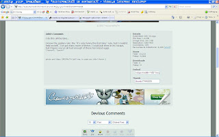
Showing the detail of the artwork and an artist comments about they work.
Scroll down abit more...
You will see the comments from other members.
You can also see the artist's profile if you click they avatar pic.
Hmm, the colour they use is not as interesting as netdiver.. =p
So the conclusion for ths website is, quite "design" but with a boring colour..And different from netdiver, deviat art is more to an online gallery than a news.


No comments:
Post a Comment