Owya, guys... I guess i should post this link also here in my blog, so you all can see those awsome videos also.. Its about using typography in a music video..
Just click this link, it will bring you there...
Can be a good references for our typography class.. =)
Monday, March 17, 2008
Saturday, March 15, 2008
digital painting :: sunset beach...
Okay so at last i finished my first digital painting assignment for visual fundamental 2 class. So..yea.....i'v come up with something not very disappointing..heheee... =)
Here it is...

For the background, our tutor teach us how to "cheat"...soo... =p
Here it is...

For the background, our tutor teach us how to "cheat"...soo... =p
Sunday, March 9, 2008
progress on web design interface
Okay here is my progress for web design class. Our 2nd project was asking us to create a website that give the user a set of tutorial about something, and in my case im doing tutorial about "stencil graffiti".
So at this point i've come up with this interface as the main page..

Feel free to leave any comments to improve my design. Thanks.. =)
So at this point i've come up with this interface as the main page..

Feel free to leave any comments to improve my design. Thanks.. =)
Wednesday, March 5, 2008
web design mistake!!
Hey guys, i got a nice refereces for us in doing web design. Its not showing the good design (which we always do when lookng a references..) but instead point out a MISTAKE in the web design itself..
Just click on this link. Hope can help us in doing our projects some how.. ^^
Just click on this link. Hope can help us in doing our projects some how.. ^^
Tuesday, March 4, 2008
navigation for a personal portfolio website
Analiyse a website for designer called BetaClan (Danny Kamhaji). This analyse i will mainly focus on the website's content planing and navigation.
This website devided into 5 sections.. The 1st is a main page, where all the things started. As you can see in the screenshot below, the navigation type is using flash animation to add on some rollover animation.

The design itself is looks like a map of a field, that have a sections sections in it, each section represent each page, for example see the screenshot below..

This screenshotshowing you the rollover fx.. It will have something popup from the ground to indicate the page inside, and the next screenshot will show you the exapmple of the page inside..


Ok, enough talking about design, lets move on to the navigation. The website's subtitle -A Music Project By Danny kamhaji- give you enough clue to know what this site will offer.
As i mentioned earlier, this website devided by 5 sections, which is: "main" page, "bio" page, "music" page, "mix" page, "links" page. The designer of this site think carefully in the web structure planning. Not too much content, but still can speak confidentially for itself.
The main page servelike other main page in other websites, its a place to start your "journey" inside a website and it also contain "news" for a quick references for the user to know the latest update. But one thing i dont really get is why they put the "contact" link inthe main page, at the edge of the page, same colour with the background and not stand out at all.. It gives me an impressions of "i dont want people to give a feedback to me, so i put the contact link hidden in the page...main page..."
The next page is a bio page. Yes, it talking about the designer's profile. Showing you and giving you more detal information . And i think they more suitable put the contact link in this page. The graphic and content not really big, so it automatically create a "space" for a link to be seen.
The 3rd and 4th page i think where the main purposes are. Showcasing his mixed music. Where the user can listen to the music. This 2 pages is not really the same actually (its a tricky part for the designer to design..), because one is mainly about his music (music page) the other one is offering the user a track where they can download and mix they own self (mix page). This small detail and offer will eventually grab attention, because he inspired the user with his music than offer them like "wanna create one also?here i have a sample for you to start with.."
The last page -links page- is giving the user a links that he found interesting and have a contribution to this website, so maybe you want to check the out an get inspired by them also!
Thats the main flow this website in my opinions.
Sunday, February 17, 2008
martha stewart vs delight.com
First i'm gonna do the analyse to Martha Stewart's website.
Screen shot >>

As you can see this website is full of content..and in my opinion they cover too much already. The 1st time i visit this website was making me so confuse, even they organize the content based on the type of the content but still its very crowded and confusing. Maybe if they have a lot of content (a lot of contents with totaly different ground!) rthey should create another website to handle another things (ground).
For the navigation system, they use a usual button placement..which look abit boring, but they overcome with a nicely use of colour. Each section have they own colour. Yea the only thing thet i like in this website is only the colour, very "family's" colour which is suit the contents.
Overall it looks too crowded...really...
*But lucky they put "search" to help the user to find what they looking for.
Not much to say for Martha Steward's website, now continue to delight.com.
Screen shot >>

Compare to Marta Stewart's website, delight.com is more organize, maybe i think because they more focus to one purpose ---> selling items.
Navigation system abit hidden at the fiet time, because they put it under the (for me..) quite big image, and no separate between the menu.
For the content they do a nice job by high-lighting an important sentence. So its easierfor user to recognize.
Another thing that good in this website is the consistancy in the layout. Using 2 columns for the above the fold and a single column for bellow the fold.
Screen shot >>

As you can see this website is full of content..and in my opinion they cover too much already. The 1st time i visit this website was making me so confuse, even they organize the content based on the type of the content but still its very crowded and confusing. Maybe if they have a lot of content (a lot of contents with totaly different ground!) rthey should create another website to handle another things (ground).
For the navigation system, they use a usual button placement..which look abit boring, but they overcome with a nicely use of colour. Each section have they own colour. Yea the only thing thet i like in this website is only the colour, very "family's" colour which is suit the contents.
Overall it looks too crowded...really...
*But lucky they put "search" to help the user to find what they looking for.
Not much to say for Martha Steward's website, now continue to delight.com.
Screen shot >>

Compare to Marta Stewart's website, delight.com is more organize, maybe i think because they more focus to one purpose ---> selling items.
Navigation system abit hidden at the fiet time, because they put it under the (for me..) quite big image, and no separate between the menu.
For the content they do a nice job by high-lighting an important sentence. So its easierfor user to recognize.
Another thing that good in this website is the consistancy in the layout. Using 2 columns for the above the fold and a single column for bellow the fold.
Friday, February 15, 2008
netdiver vs. deviant art
Okay.. Its been a long time already not posting any blog.. because at CNY just wanna rest all day...umm, not really all day..argh!nevermind, just start with my analysis, okay?!..
I'll start with netdiver.net first..
First of all the thing that shout to you about the content of this web page is its header ---> "(we) LUV everything design" in a high-class blue colour box that stand out in a black background. So a this stage you will set your mind to recieve all about arts.

Next about the navigation system... I think for a design website is not really "design" yet, for me its just looks like an ordinary corp. website because of its left-to-right button arrangement. But because of its simplicity of a button arrangement, it will not confuse the first time user.
ngg..but too much button also not a good idea. Maybe they can put the type of an artwork into 1 menu, and after you rollover the menu button than the whole sets (flashware, illustration, etc..) will come out..
As you scroll down (it is a long page...), you will see the news update, an artwork, and a screen shot or a thumbnail to support the news or information. Hierarchy is nice, with using only a simple grid line system (2 columns), which again a not very "design" for a design website. This grid system applied in every pages.
Ok, so the conclusion for this website is; main focus is about news and updating events in an art industries, but not on the artwork itself. This site is more to a place to put link to the artists website.
Owh, 1 more thing i very like from this website is the colour they use ^^


This show you the art work.

I'll start with netdiver.net first..
First of all the thing that shout to you about the content of this web page is its header ---> "(we) LUV everything design" in a high-class blue colour box that stand out in a black background. So a this stage you will set your mind to recieve all about arts.

Next about the navigation system... I think for a design website is not really "design" yet, for me its just looks like an ordinary corp. website because of its left-to-right button arrangement. But because of its simplicity of a button arrangement, it will not confuse the first time user.
ngg..but too much button also not a good idea. Maybe they can put the type of an artwork into 1 menu, and after you rollover the menu button than the whole sets (flashware, illustration, etc..) will come out..
As you scroll down (it is a long page...), you will see the news update, an artwork, and a screen shot or a thumbnail to support the news or information. Hierarchy is nice, with using only a simple grid line system (2 columns), which again a not very "design" for a design website. This grid system applied in every pages.
Ok, so the conclusion for this website is; main focus is about news and updating events in an art industries, but not on the artwork itself. This site is more to a place to put link to the artists website.
Owh, 1 more thing i very like from this website is the colour they use ^^
First page that they will show you when you enter this website is the newest updated artwork by the members.

As you can see from the screen shots, the arrangement of the contents are very clear, with a nice chunking contents (devide into a categories).
Navigation system they use for this website is using an icon to support the text. So you can easily recognize it.
Unlike netdiver, deviant art is more to a artwork submission website, where the member can submit they own design to view online. From the main menu, you can click one of the thumbnails to view its detail..
Example...

This show you the art work.
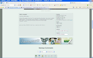
When you scrol down...

Showing the detail of the artwork and an artist comments about they work.
Scroll down abit more...

You will see the comments from other members.
You can also see the artist's profile if you click they avatar pic.
Hmm, the colour they use is not as interesting as netdiver.. =p
So the conclusion for ths website is, quite "design" but with a boring colour..And different from netdiver, deviat art is more to an online gallery than a news.
Subscribe to:
Comments (Atom)